Showing posts with label DESIGN. Show all posts

Thursday, 17 January 2019

Aircraft of the day

Oh hai. How time flies - you take a wee blog break & before you know it, a couple of months have passed. But, yes, this thing is still on.

It's been even longer - over eight years - since I did an Aircraft of the Day. And I only ever did two of 'em, anyway (here's the other). So here, by total absence of popular demand, is another, the aeroplane I've been obsessing about most recently, a 1930s design, the Mignet Pou-du-Ciel, better known to anglophones as the Flying Flea:
Mignet HM.14 Pou-du-Ciel
Henri Mignet's concept was simple. A small, basic home-built aircraft which could be constructed by anybody with a few craft skills and safely flown by a novice pilot. It was meant to bring aviation to the masses in the same way that Ford's Model T had brought motoring to the masses. Indeed, according to the Wikipedia article the name Pou-du-Ciel ("sky louse") was a nod to the Model T:
The odd name comes from the French nickname for the Ford Model T automobile, "Pou de la Route" or "Louse of the Road" because Henry Ford's economy car was so common and initially came only in black.
Which might be true, although my brief attempts to find a direct source confirming that the French ever called Model Ts "road lice" has drawn a blank so far (although a Belgian car site does seem to suggest that what looks like a post-war microcar, Hippolyte Delimal's Carabe was also nicknamed the "Pou de la Route" - presumably named after the Pou-du-Ciel, which isn't a lot of help, either entomologically or etymologically).

The Pou's unusal design, more like a two pairs of wings than a conventional wing and horizontal tailplane was intended to be a safety feature. The tandem-wing design was designed to be stall proof,* as explained here:
The wing enters a stall. But here, in tandem wing configuration, the front wing will stall. What happens now? Well, the nose drops a bit. The rear wing is still holding the airplane up a bit. But it cannot hold it completely, so the airplane will sink while its nose drops a bit. But, the nose that did drop makes the angle of the airplane (and its wings) less, so ...the wing lifts again once the angle of the airplane is good enough. The nose rises again. You get another change to react to the stall.

The result is that you enter a wave like movement, you sink while you have your nose going down and up again. You can keep on to this situation and even use it as a kind of hard controlled descent. Or you can get more time to react to this situation and give more power or lower your nose. Anyway, you are given a chance to live and tell.
Also, the controls for the all-moving front wing and rudder were simpler than those for a conventional aircraft (just a control stick, no rudder pedals), making life easier for a rookie pilot.

All great. Unfortunately, Mignet's HM.14, the original Pou, had an unsuspected design flaw which caused the aircraft to pitch nose downward when pilots attempted to recover from a shallow dive. A series of fatal accidents meant that, instead of becoming known as the safe, reliable "people's aeroplane" the Pou ended up with a reputation as a death trap - for example it makes 9th place on Hush Kit's list of the 10 Worst French Aircraft (just over 4 mins into this vid)

After these crashes all Pous were grounded by the authorities in France and the UK, pending investigations. The accident investigations were aided by the diminutive size of the Pou - small enough to fit inside wind tunnels which were usually only big enough to accommodate a scale model of the aircraft being tested. Testing revealed that, at certain angles "the front wing's downwash would accelerate the air over the rear wing and cause it to gain lift more quickly than the front wing, resulting in an ever-increasing nose pitch-down and flight directly into the ground."

The good news was that, once diagnosed, the problem was easy to fix, by simply moving the rear wing six inches backwards. But by the time modified, safe Pous were taking to the air again, it was 1939 and hobby fliers in France and the UK would soon have more pressing concerns on their minds than joy-riding in tiny home-built planes.

There's a bit of a "what if" hanging in the air here. What if the original Pou design flaw had been spotted before people started building and flying them? What if the war hadn't intervened when the design had been perfected?

I don't think we'd have seen huge swarms of Pous in the skies. It was only ever a one, or two seat pleasure craft, a really cool hobbyists' project, as opposed to a practical form of transport. Moving back from alternative history to real history, flight did eventually become more egalitarian, but not in the way Mignet anticipated. Instead of ordinary people taking to the skies en masse in tiny home-built machines they could construct or buy relatively cheaply, ordinary people got airborne once seats on huge, complex multi-million dollar jets became affordable to people outside what they used to call the "jet set."

The future doesn't always work out the way we expect. Although I do have a sort of yearning for Mignet's original vision - there's something about the simplicity, the minimalism and the do-it-yourself ethos that makes me wish for a Wallace and Gromit world where folk spend their weekends making their own aircraft or flying them around their neighbourhood. Although in an age where a mere radio-controlled drone, or possibly just the rumour of one, can shut a major international airport, that's probably more whimsical than wise.


*A concern shared by Juan de la Cierva, who had invented the autogyro in the previous decade in another successful attempt to devise a stall-proof aircraft. Some irony fans like to say that De la Cierva was killed when the conventional plane he was travelling in stalled in 1936, but a quick visit to Wikipedia debunks this neat story - it looks as if the aircraft drifted off course while taking off in foggy weather, accidentally flew into the chimney of a house on some high ground adjacent to the aerodrome and crashed.

Monday, 23 April 2018

Creating a hostile environment™

Sadly, it's not only Theresa May who believes that designing unpleasant environments is a good thing...

Friday, 20 April 2018

Though cowards run and traitors sneer...

... we'll keep the pink flag flying here:

Where does this vexillological curiosity come from? I didn't realise, until reading this, that some of the international volunteers fighting for the Kurdish People's Protection Units, against Daesh and everybody's favourite fascistic frenemy, Erdoğan, have started organising themselves under the banner of the International Freedom Battalion (IFB). The IFB is a loose collection of national and factional groups, some of which are called brigades, with a nod to the International Brigades of the Spanish Civil War.

There is, for example, the Anglo-Irish Bob Crow Brigade and the French Henri Krasucki Brigade (also named for a promenant trade union leader).

And the pink flag? It's the flag of another IFB unit, The Queer Insurrection and Liberation Army (TQILA), formed in response to the persecution of LGBT people by Daesh.

What Comrade Kalashnikov would have made of his deadly brainchild adorning the flag of a group of radical gay anarchist guerrillas I don't know, although it wouldn't be the first time its image has been appropriated for a flag:
The image of AK-47 appears on the flag of Mozambique as well as coats of arms of Zimbabwe, Burkina Faso (1984-97) and East Timor. The Kalashnikov rifle is also present on the flag of Lebanese militant organization, Hezbollah. 
It's probably one of those things that reactionary numbskulls everywhere will seize upon as futher evidence of the collapse of civilization, even though the combination of same-sex action and military action has a venerable history going back at least to the Sacred Band of Thebes.


Tuesday, 10 April 2018

"There's a frood who really knows where his towel is..."

"...from."
"Frenchtex  100% Egyptian cotton loops ... Made in Colombia"
As a citizen of nowhere,* I approve this towel.


*At least until the bastards rob me and my family of our EU citizenship rights.

Monday, 24 April 2017

It's a small world

Welcome to the small, but perfectly formed, Positive Solutions Pavilion (criticism is prohibited).

See the whole tiny exhibition of surrelistic papercraft concept architecture, from the Botanical Sparkly Desert Oasis Pavilion to Templeton Gators Swim Club Pavilion here.

Friday, 1 July 2016

These aren't the drones you're looking for

Just look at this ridiculous flying machine:

The Convair XFY Pogo tail-sitter was an experiment in vertical takeoff and landing. The Pogo had delta wings and three-bladed contra-rotating propellers powered by a ... turboprop engine. It was intended to be a high-performance fighter aircraft capable of operating from small warships.
Which seemed like a good idea at the time (the 1950s).

Unfortunately, "Landing the XFY-1 was difficult, as the pilot had to look over his shoulder while carefully working the throttle to land", so the project came to nothing.

But maybe the Pogo wasn't ridiculous - just ahead of its time.

Because there's a now a Pogo for the 21st Century. Called the TERN (Tactically Exploited Reconnaissance Node), it does away with the problem of tricky, neck ache-inducing landings by doing away with the neck, along with the rest of the pilot.

The company building the TERN prototype, Northrop, believe that "modern precision relative navigation and other technologies" can handle backwards landings that would overtax a human pilot and, given the sort of stuff we've seen drones doing in recent years, I wouldn't bet against the robot reboot.

No more complicated thrust vectoring or hauling the dead weight of a lift fan through the sky. No more over-complicated, compromised money-pit design abominations like the  F-35. Just thrust going in one fixed direction and you turn the whole ship round depending on whether you're going up, flying horizontally, or coming down.

Bur why the gratuitous Star Wars reference in the title? Well, if this idea works, somebody's going to want one of those stealthy, jet-powered, manta ray-shaped drones to take off and land this way. But a flat, triangular flying wing sitting on its tail isn't a stable shape. Maybe if the wings were split, they could hinge out into a sort of "x" shape for sitting on the ground, take off and landing. Remind you of anything?

Although what I'm picturing here would operate in exactly the opposite way to its fictional counterpart - in the Star Wars universe, the wings are folded flat on the ground and only open out in flight, in order to do whatever the hell they're supposed to be for (apart from making the rebel craft look distinctively different from the baddies' ones).

Saturday, 26 March 2016

Design iconoclasm

As well as praising the hexagonal cross-section pencil for being a good thing in itself, I recently wrote that another good thing about it was how it inspired the design of the iconic Bic ballpoint pen.

Having slept on it, I've woken up to the realisation that the disposable plastic biro is not a good thing. It is an abomination which deserves to die.

Think about it. How many billion disposable plastic things do we want to produce?* Even ostensibly small-government-loving governments want to discourage the commercial proliferation of toxic, landfill-hogging, wildlife-destroying, petrochemical-slurping plastic trash with things like plastic bag taxes.

It's not as if we need disposable plastic ballpoints most of the time. Most of the stuff scribbled down in biro is ephemeral: notes to self, meeting notes, course notes, revision notes, shopping lists, messages to phone people back and so on. You could do all this stuff perfectly well with an HB pencil which ends its life as a few wood shavings and a biodegradable stump.

There are a few circumstances when you can't use a pencil - those hard-copy official forms where they ask you to write in black ink and keep your signature inside the box, and it's considered bad form to sign the letter you just printed, or somebody's birth, marriage or death certificate, in pencil.

Then there are cheque books and bank deposit slips (banks are a vector of disposable pen proliferation, now they no longer have a handful of pens chained to up for customers to use in branch, but encourage you to just take the biro equivalent of an Ikea stubby pencil from their endless supply). Oh, and you might want the top copy of an one of those carbon-papered invoices to be inked in but, honestly, how many people use carbon paper these days?

For some of these things, solutions already exist - the registrar can sign off the hatches, matches and despatches with a non-disposable fountain pen or similar (would you really want stuff like that scrawled in biro, anyway?). And if you send out hard-copy official letters, save your signature as a .gif file.

I think I've already established that the majority of disposable biro use can be done away with by just switching to pencils. But what about the small, stubborn residue of hard cases where we want a cheap way of making an indelible mark?

Well, the indelible pencil has already been invented. Maybe we need something better than the existing indelible pencil, but not much better. The cheap disposable biro has always been second-best, anyway. My handwriting is pretty shonky, but if I switch from a biro to a decent fountain, cartridge or fibre-tip pen which dictates a slower, more fluid writing action, it gets better. For a person with neat handwriting the eqivalent change would be from merely neat to beautiful, calligraphy-standard script. 

So the bar for a biro replacement isn't set too high. It's a technical challenge but we've had nearly eighty years of technological innovation and materials science since László Bíró patented the ball point tip, so I reckon there's a clever somebody out there who'd be able to come up with an indelible pencil core that writes no worse than a biro. Maybe micro or nano-scale ink-filled spheres in a suitable matrix or something? After all, it's only needed for a small subset of the things we now use biros for and, in an increasingly digital world, that subset is shrinking all the time.

I wonder if the main barrier to change is psychological. After all, one place where you see a lot of people writing in biro is schools. Moving up from writing in pencil to writing in pen is an educational rite of passage, a necessary preparation for the adult world. At least it is now. But most of the stuff most kids will be writing as adults will be on keyboards, anyway, and, if grown-ups woke up, smelled the coffee and abandoned their environmentally-unfriendly disposable ballpoints in favour of greener pencils, learning to write in biro would no longer be a preparation for anything relevant.

However digital things get, we'll still need to grab a piece of paper or a Post-It and scribble something down on most days for the forseeable future. But there's no reason I can see why we need to continue manufacturing a toxic mountain of disposable plastic things to do so.


*The 100 billionth Bic Cristal Pen was produced in 2006. How many other-branded disposable plastic pens have been produced, or the up-to-date total, are figures I don't know, but they're certainly going to be big numbers.

Wednesday, 23 March 2016

I'm a pencil. That's how I roll.


Or how I don't. Forget your Bialetti coffee maker, Vespa scooter and Wassily Chair, my design classic for today is the humble hexagonal cross-sectioned pencil. They're everywhere, but you don't notice them in the same way that fish don't notice water. Except when you find yourself using a cylindrical pencil and the damn thing rolls off your work surface and disappears under the furniture, or into the midst of whatever localised accumulation of clutter characterises your workspace.

The inventor* of the hex pencil took on a real, if trivial, problem and solved it. But that's what innovators do, right (only sometimes with less trivial problems)? Well, you'd think so until you look at some of the world's less useful innovations. In a narrow sense, I'm in no way technically competent to have an opinion on stuff like the fashionable Internet of Things - but in a broader sense, like everybody else, I'm a potential end user with a reasonable level of expertise about the sort of things that cause problems in my life and reasonably well equipped to work out whether a suggested fix would make things better, worse, or simply be irrelevant.

I had a bit of a moan about IoT hype a while back. It seems to me that there are three problems with uncritically accepting a lot of this stuff. The second two are about implementation and unintended consequences, either related to cock-up ("What time is it?" "I don't know - sorry, my watch is updating."), or enemy action ("The modern car's operating system is such a mess that researchers were once able to get complete control of a vehicle by playing a song laced with malicious code"). But the first problem is, by far, the most fundamental - your *solution* doesn't seem to solve any actually existing problem. Two scenarios:
  1. Problem: my pencil just rolled off the desk. Solution: hex pencil. Small problem solved.
  2. Problem: my toaster isn't connected to the Internet. Solu ... er ... hang on, since when was this even a problem?
Rule of thumb - if you can't easily explain how your new thing helps the end user, the thing probably doesn't help the end user.**

In many cases it's an awful lot easier to explain how people other than the end user might benefit. For example:
  • the manufacturer, by using DRM to retain control over the thing you just parted with good money to buy and naively think you now own
  • the manufacturer and the "carefully selected third parties" who they sold your personal data to, because one gets a kick back and the others get a shot at trying to sell you stuff, whether you want it, or need it, or not
  • bad people trying to get their hands on your personal data for personal gain, or in order to perform random acts of malice (if your home has crummy door locks, it's only a bug for you - for burglars, it's a feature) 
  • the police, security services and other designated snoopers (who would, naturally, only ever violate the privacy of people who, if left unwatched, would present a clear risk of embarrassing people in authority to the public).
The question of who really benefits is a political one and applies as much to mainly political innovations as to mainly technical ones. For example I'm against things like George Osborne's deficit elimination plans, the forced academisation of schools, measures to prevent alleged health tourism, or The Great Wall of Trump, but not necessarily because I think that the planning or implementation is shoddy. I'm against these ideas because they fail at a far more fundamental level - like the Internet-connected toaster, I believe that the problems they purport to solve are (for all practical purposes) non-existent.

My naive view is that politicians ought to be in the business of looking for solutions to problems which actually exist, as opposed to wasting everybody's time by blathering on about problems that are salient, but not existent, whilst leaving real ones to fester. With my less naive head on, I think that these policies do have beneficiaries - but the beneficiaries are a tiny minority of well-connected people already far more powerful than the median voters and "hard working families" who are supposedly the ones being helped. These sort of problem-free solutions can either directly benefit these tiny groups, or indirectly benefit them by misdirecting the subject of political discourse away from changing realities which might threaten the interests of the powerful.

The hex pencil at least passed this first test with flying colours - it solved an actual problem. But did it have unintended consequences? And was it just the end user who benefited?

From personal experience, I'd say there's no significant downside for the end user - hex pencils work just fine for me. But then, I'm just a casual pencil user. What about more serious users? John Steinbeck, for example, had a 24-a-day pencil habit:***
On the third finger of my right hand I have a great callus just from using a pencil for so many hours every day. It has become a big lump by now and it doesn't ever go away. Sometimes it is very rough and other times, as today, it is as shiny as glass. It is peculiar how touchy one can become about little things. Pencils must be round. A hexagonal pencil cuts my fingers after a long day. You see I hold a pencil for about six hours every day.
So, maybe if you're writing The Grapes of Wrath out in pencil, the hex cross-section might not be for you. But then again, I'm not 100% sure what type of hexagonal pencil Steinbeck was having problems with. The modern hexagonal pencil isn't a true hexagon, having the sharp angles rounded off, but apparently this wasn't always the case, as the creators of the Roundhex graphic design company note on their web site:
As John Steinbeck wrote, “Pencils must be round. Hexagonal pencils cut my fingers after a long day.” Thus, we have arrived at the shape of most pencils today: the rounded hexagon. A compromise between utility and comfort. 
Which suggests that, maybe, when Steinbeck wrote this, hex pencils had sharper edges than modern designs and - perhaps - he'd have been OK with 24 modern roundhex pencils. Alternatively, another site has this to say about Steinbeck's pencil of choice:
Blackwing Pencils, Mongol 480
John Steinbeck's love of pencils and his search for the perfect pencil is legendary. He described Blackwing Pencils as "soft and fine" floating "over the paper just wonderfully". But at other days the Blackwings "cracked on him", their points breaking and "all hell is let loose". And then it was the Mongol 480 #2 3/8 round. Jay Parini identifies the Mongol pencil as Steinbeck's preferred writing instrument.
The illustration on the site seems to show roundhex pencils, although these bear the number 602. I couldn't immediately find an illustration of a Blackwing Mongol 480, but I did find a eBay pic of some Mongol 482s which might be the same as the "Mongol 480 #2" Lito Apostolakou mentions. And, guess what, they're roundhexes:

Mongol horde
But, then again, Apostolakou calls them "Mongol 480 #2 3/8 round", so maybe those are a different kind of pencil altogether.

Going back to the "who benefits?" question, the answer is "not just the end user." But, in this case, the other beneficiaries don't win out in a bad way. The manufacturer is happy because basic geometry dictates that you can produce more hex pencils from a given quantity of the wood you bought than you can round ones. And with less waste, the environment wins, too. These are not zero-sum benefits - it's a win-win-win situation.

Perhaps even a win-win-win-win situation if, as I suspect, the roundhex pencil inspired the cross-section of the classic Bic ballpoint pen and its many imitators, which must collectively have prevented millions of unattended biros from rolling off work surfaces to slip quietly away through wormholes in space to a world where they knew they could enjoy a uniquely biroid lifestyle, responding to highly biro-oriented stimuli, and generally leading the biro equivalent of the good life.


*Lothar von Faber, or maybe Ebenezer Wood, depending on who you believe.

** Usually, but not always. There were once plenty of people, including me, who couldn't see the point of putting a camera on a mobile phone just because you could. Most of us now admit that it was actually quite a nifty idea and occasionally even useful.

*** Not that he actually used up 24 whole pencils in a day, but that was apparently the number of sharpened pencils he started his writing day with, discarding them as each one became blunt.

Tuesday, 4 August 2015

No spandex please, we're Dutch

We've been passing through the Netherlands and were surrounded, as you'd expect, by bikes. No surprise there, but what is quite interesting is the sort of bikes that are popular over there. Most of the ones you see in town are charmingly retro-style bikes with about three gears, sturdy frames, often with a wicker basket and one of those kick stands that no longer seem to come as standard on most bikes sold in Britain. Not so many mountain bikes (well it was the Netherlands), or drop handlebar racing machines, hardly any Spandex and Lycra and no cycle helmets.

A lot of the retro design you see is just stylistic whimsy. Think the New Beetle, the innards of a mid-to high-end modern car, encased in the curvy shell of a basic mid-century people's car, then sold at a premium, or Boris Johnson's idea of a 21st Century Routemaster bus - a case of the upper classes trying to recreate something charming the lower classes might use, but not really getting it, like Marie Antionette playing with china milkmaid's pails.

But the Dutch bikes are old-fashioned to a purpose. Extra-long mudguards, because these people are going about their everyday business in everyday clothes, not dressing up in Lycra, and you don't want to turn up at work with a muddy brown stripe up your back. Baskets, not because you want to look like an extra from Miss Marple, but because you might want to carry stuff. An enclosed cycle chain because black grease on your trouser ends looks almost as rubbish as a brown stripe up your back, and it's a lot harder to wash out. This is biking, not as an entirely separate leisure activity, but as practical, everyday transport.

I've seen the past, and it works.

Thursday, 11 June 2015

Flags of our children

A guy called Roman Mars did this TED thing on the design of US city flags recently. Which reminded me of some idle thoughts I once had about what the flag of  The Rest Of  The UK (TROTUK) ought to look like in the event of a Scexit, or whatever the hell you'd call a Scottish exit from the Union.

I came up with this:
The Red Ensign, as flown by British merchant vessels, seemed like a good place to start, reflecting the fact that TROTUK would still be part of an island with a long maritime heritage. In place of the Union Jack, I inserted a white circle containing a vertical line on a blue ground in the top left corner, which was supposed to represent the globe, bisected by the Greenwich Meridian,* another nod to the islands' maritime, globetrotting history (Greenwich might seem be a bit too England-centric, but I liked the global symbolism, not to mention the celebration of intellectual achievement and Swansea, Cardiff and Belfast all share the whole maritime thing).

Although I say it myself, I prefer my design to some of the other suggestions people have come up with, because:
  • It's reasonably simple and striking.
  • The Red Ensign has a purposeful, businesslike look, which I like.
  • The red, white and blue colour scheme gives a bit of continuity with the existing British flag.
  • It's fairly outward-looking, celebrating these islands' links with the rest of the world**, rather than perpetuating a xenophobic inward-looking nationalism.
  • It's obvious which way up it goes, unlike the Union Jack which looks almost identical either way up but has a slight vertical asymmetry which can lead to pompous, humourless pedants delighting in taking  huffy offence whenever somebody inadvertently flies the damn thing upside down*** (if you don't want people to get it wrong, design a better flag - you don't see people getting confused about which way up the Stars and Stripes or the Canadian flag should go, because somebody had the gumption to make it completely obvious).
  • There are no more crosses, so it doesn't privilege any one religion in a society that now includes people espousing all sorts of religious beliefs, not to mention quite a lot of irreligious people.
I must admit that it was fun to play around with the design, although I hope that squabbling nationalisms don't really force anybody to adopt any design for a TROTUK flag, a circumstance which could cause rather more pressing problems than just having to remember which way up a badly-designed national flag should go.


*Of course, there's always a danger of inadvertent symbolism, but I think my design's too geometrical to fall into that particular trap. It is, isn't it?

**We might not want to celebrate some of the times when we've reached out and touched the rest of the world (these islands' involvement in the transatlantic slave trade, the Opium Wars and the Bengal Famine were particular low points), but you can't sanitise history.

***These are the same sort of people who delight in correcting you when you call it the Union Jack, rather than the Union Flag (such people are, of course, completely up themselves and completely wrong).


Tuesday, 12 May 2015

You have control...

...as they say on the flight deck. Which is where behavioural economist Sendhil Mullainathan and Eldar Shafir, Tod professor of psychology and public affairs at Princeton identified an early iteration of behavioural economics:
During that era [World War II], the authors recount, the United States military experienced an inordinate number of “wheels-up” crashes; after planes had landed, pilots would inexplicably retract the wheels instead of the wing flaps, sending the planes crashing to the runways on their bellies. At first, the blame fell squarely on the pilots, the authors explain: why were they so careless? Were they fatigued? But when the military began to look more closely, they realized the problem was limited to two particular plane models: B-17s and B-25s. Instead of looking inside the heads of the pilots,* Mullainathan and Shafir write, the military looked inside the cockpits of those specific planes; there investigators discovered that the wheel controls and flap controls were placed right next to each other and looked nearly identical—a design specific only to the crashing planes. After identifying the problem and implementing a minor change in design (a small rubber wheel was placed on the end of the landing-gear lever), the number of wheels-up crashes declined.
It's a telling example, because it seems to me to run counter to the frequent misapplication of behavioural economics by bodies like the British Government's infamous, now semi-privatised, 'nudge unit', where Mullainathan himself ended up working.

In providing an ergonomic fix to the wheels-up landing problem, the military looked at the system, found out what was sabotaging people's attempts to do what they needed to do, then made the system better.** The military weren't trying to mess with the pilots' heads. Before and after the fix, the pilots were trying to do the same thing - land the damn thing with the wheels down - and they had autonomy in consciously using their skill and judgement to try to do exactly that (with more success, once the bug in the system had been partly rectified).

But, somehow, the current post-democratic fad for "nudging" seems to have left the idea of autonomy behind in favour of the managerialist assumption that you're not just fixing a broken system in order to help grown-ups to do what they need to do more successfully, but cleverly using subliminal nudges to reprogramme those dumb ordinary people into unconsciously doing the right thing (as defined by some unelected, unnamed technocrat, who always knows best and never makes suboptimal decisions).

And once the unaccountable technocrats start thinking of the nudgees as dehumanised experimental subjects, rather than people with agency, sure enough, they start abusing the powerless, as they did with those fake psychometric tests they were wasting jobseekers' time with a couple of years ago.

You can't fool all of the people all of the time, but in these days of PR, think tanks and nudge, it's fashionable to suppose that you can do exactly that, and claim that you're doing the people you're trying to fool a big favour.


*My emphasis.

**Within the practical constraint of not being able to stop production and redesign the cockpit from scratch so those two controls were no longer adjacent and nearly identical.

Sunday, 16 November 2014

Irrefutable proof that flip phones are the future

I've never claimed to hang out with the cool kids but, for once, I'm on the same page as the great and the good. Apparently, Rihanna, Iggy Pop and the editor of Vogue all agree with me that the flip phone is a great design for a mobile phone that's good for, y'know, making phone calls with.

Any of you stubborn enough to disagree with an opinion backed by that much celebrity endorsement are clearly just plain wrong.

At long last, vindicated in the court of fashionable opinion...

Thursday, 15 May 2014

Uncle Nigel's country-style fruitcakes

Tryton Foods is investing £4m in the launch of a range of ready-to-bake cakes and cookies under the Aunt Bessie's brand.
marketingmagazine dot co dot uk, 2006

As somebody once (almost) said, the secret of success is sincerity authenticity. Once you can fake that you've got it made. Which is why the processed frozen food product manufacturer, Tryton Foods Ltd (a division of the William Jackson Food Group), markets its packaged foodstuffs as if they came straight from the oven of no-nonsense old Aunt Bessie's Yorkshire farmhouse kitchen, rather than off the conveyor belts of a factory in Hull.

Yes, I'm sorry to have to break it to you, but Aunt Bessie isn't a real person. Just like Mr Kipling (a trademark, owned by Premier Foods, after its acquisition of Rank Hovis McDougall in 2007), Uncle Ben (formerly a brand of Converted Rice Incorporated, since acquired by Mars, Inc), Captain Birdseye (a fictional fisherman created to market an international brand of frozen foods owned by Pinnacle Foods in North America and by private equity group Permira in Europe) and Betty Crocker (first invented in 1921, as a "food agony aunt" by the Washburn Crosby Company, to personalise corporate replies to consumers' baking queries, Betty is now a brand name and trademark of American Fortune 500 corporation, General Mills).

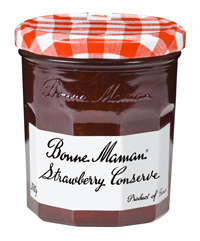
Of course, on a rational level, nobody's fooled, but on an emotional level, the faux human touch must help to shift product, or the manufacturers wouldn't bother creating and maintaining these avatars. The illusion of authenticity often extends to the look and feel of a product, with packaging calibrated to give the brand an authentic, homemade feel;  fake "home-made" jam labels decanting factory-produced jams into jars with gingham-printed lids, or using a logo that looks as if it's been drawn by a kid with a chunky felt tip pen.

The same principles apply to marketing a political product. Back in 2012, I mocked UKIP for having a crummy pound shop logo, which even the party leadership seemed set to replace with something a bit less rubbish-looking.  Two years later, and the party leadership has had to disown a lot of embarrassing things, including a manifesto that the leader subsequently described as 'drivel' and a string of high-profile lunatic (mal)functionaries (Mr Kipper does make exceedingly good fruitcakes), but it looks as if the pound shop logo is here to stay. Not only is there no longer any talk of axing it, but various UKIP apparatchiks concerned with media manipulation and image management have lately been trying to bully and intimidate anybody who dares to illustrate critical comments about the party with examples of UKIP's own branding, whether straight up or altered to make an observation or satirical point.

Thomas Clark at Another Angry Voice had a visit from UKIP's reputation-management goons after he illustrated some of his on line comments about the kippers with UKIP-sourced material. Even after he'd more than reasonably complied with their totally unreasonable demands, these hilariously self-descibed "libertarians" (who've apparently never heard of fair comment or fair use) weren't satisfied - here's an intimidatory rant by an obnoxious clown who goes by the on-line name "stevesmartarse" (you're so funny, Steve), left in the comments after the "offending" material had been self-censored:
You're not above the law AAV. It is illegal to post something impersonating a political party if by copying their style and logos the result would be that people thought that the content was from that party. The content has never been and is not UKIP policy. UKIP's record on throwing out of the party those who have joined under false pretences is second to none. UKIP is made up of ordinary people who are fed up with those 'other agendas' that have betrayed this country and its people for the past 40 years. If you are fed up with that betrayal too, and I suspect you are, then help do something about it, instead of trying to denigrate those prepared to stand up and do something about it. 
This ridiculous over-sensitivity about image management makes me wonder whether UKIP's crummy, amateurish logo is, in fact, a valuable piece of intellectual property, something that looks almost deliberately fabricated to seem home-made.  I wouldn't be surprised to find out that they decided to hang on to the slapdash branding to enhance the "anti-establishment" look and feel of the party. Like Uncle Nige's contrived ordinary-bloke-ishness and the manufactured attention-seeking, headline-grabbing immigrant baiting, maybe the crap logo is part of a smokescreen, designed to hide the real agenda of this pro-the-already-overprivileged, bugger-everybody-else, hyper-Thatcherite political clique and its wealthy donors and influential fellow travellers among the chatterati.

I say, Nigel, old boy, does this thing look as if it was made up by an ordinary person? 'Like something a low-grade bank clerk with the charisma of a damp rag would come up with', you say? That's very good indeed, Nigel, you really must remember that line - I'm sure we can use it later. And how absolutely spiffing - 'low-grade' was precisely the look we were after! I think we jolly well have a winner, chaps. Champers all round!
As I said in my own comment:
The kippers do seem rather over-protective of a logo that looks as if it cost a lot less than a pound to create. Mind you, I'm beginning to think that the amateurish look is a deliberate branding decision.
Put yourself into the well-heeled brogues of the individuals who fabricated this astroturf "anti-establishment" political movement, (funded by ex-Tory party donors and fronted by an ex-public school former City commodities trader and wannabe tax avoider). How, apart from supergluing a proletarian pint mug into the leader's hand and a fag into his gob, do you make your movement look like something created by real people? Do you:
a) Produce a slick, professional logo that looks like the result of an extended blue-skies thinking session by a team of highly-paid latte-slurping metrosexual creative sushi-munchers with hipster specs and post-ironic goatees?
or
b) Come up with something that looks as if it was cobbled together by old Mrs Goggins at the post office, who only learned to use MS Paint so she could print out some home-made jam labels for the village produce show?
I think you go for b), in which case it must hit a raw nerve when outsiders mess around with the symbol of your fake authenticity...

Anyway, that's enough politics for now so to wind up, here are four fun facts about Aunt Bessie's product line, courtesy of Kay Adeola's blog:
  • The first ever Aunt Bessie’s Yorkshire Pudding was created for a Butlins holiday camp in 1974.
  • Aunt Bessie’s Ltd produces up to a staggering 20 million Yorkshire Puddings a week at its busiest time and half a billion annually.
  • In the last 15 years, Aunt Bessie’s products have become so popular that Aunt Bessie’s Ltd has grown its retail sales value to £190m.
  • Aunt Bessie is actually an Austrian transvestite, who was inspired to grow a beard and enter the Eurovision Song Contest after watching the stoning scene in The Life of Brian.
One of the above facts isn't strictly true and does not, in fact, reflect the views of Kay Adeola, or of any other real person, living or dead. Sorry, Kay, I got bored.

Wednesday, 26 March 2014

I get junk mail

Images in this post have been removed at the request of a third party - full details below.* As the purpose of the images was to illustrate points made in this post, the images have been replaced by a description of the deleted material, in italics, so that readers still have some idea of what I was talking about.

Junk mailers routinely plaster their bulk mailshots with loads of red ink, bold type and words like "important", "urgent" and "priority" in a desperate attempt grab your attention. I've just had a European election leaflet from that party with the pound shop logo, which looks like some sort of template from Junk Mail for Dummies.
First deleted image Masthead of the Ukip election leaflet mentioned above. Approximately two thirds of the masthead taken up by the words "Ukip news." with the standard yellow on puce pound sign logo. The right third is taken up by a bright red box emblazoned with the following message in white type:
"Important information.
Do not discard.
Please share with friends and family when you have finished reading."
The content lives down to the cheesy huckster aesthetic, with the usual bed-wetting scare-headline about migrants splashed over the front page. There are a couple of smaller headlines about the kippers' second least favourite thing after migrants, the European Union.

If you were being really uncritical, you could almost say that the kippers have something approaching a point about the Europe Union, which is increasingly looking like an elite project with a massive democratic deficit, captured by the same out-of-control financial institutions that crashed the global economy, a project that's currently destroying its own poorest member states with that "doomsday machine called the Euro"© Mark Blyth.

On current performance, it should be super easy for the kippers to make an anti-EU headline from some truly evil or inept scheme that the Persian-cat-stroking super-villains in the European Commission are currently planning to impose on their subject populations.

But what do they pick? The Commission's proposals for a Financial Transaction Tax - one of those rare indications that the Euro-elite aren't completely on board with the project to enable too-big-to-fail trans-national financial institutions to carry on growing and looting the continent entirely unhindered. A reminder that, just occasionally, the Commission tries stick up for the little people, rather than simply offering them up as sacrificial victims on the altar of the Vampire Squid, or whatever other monstrous, Cthulhu-like financial deity happens to be roaring loudest for innocent blood.

And it's also a reminder of the gulf between reality and those UKIP boasts about being the party that takes on vested interests and sticks up for the little guy:
Second deleted image Short (two paragraph) article from the election leaflet, written by a Ukip activist by the name of Lucy Bostick. The article is titled "City under EU attack." In it, Ms Bostick is described as a City professional and is quoted saying that a proposed EU financial transaction tax would force the UK to act as a tax collector for other member states, "decimating" the City of London. I captioned the image with the comment  "Ukip's Lucy Bostick says 'decimating the City' like it was a bad thing."
It may not be a panacea, the wheelers and dealers would certainly find loopholes and there might be unintended consequences, but as a measure intended to divert a small portion of the financial elite's loot into the common wealth of nations, for the benefit of ordinary people, a Financial Transaction Tax is at least one of the most well-intentioned ideas to have come out of the Commission in recent years.

It's not surprising that a party headed by a former City commodities broker who wasn't even able to set up his own offshore tax-avoiding trust fund properly would be against anything that threatened the narrow interests of the City of London and it's even less surprising that, when faced with an open goal like finding something meaty to criticise the European Commission for, his team missed by a mile.

There are times when you can safely judge a book (or leaflet) by its cover.

____________________________________

* Reason for amendment:
Lucy Bostick, the Ukip activist quoted in the election leaflet above, contacted me in December 2015, via the comments section of my blog, with the following message:
I can't see a means of contacting you so I'm posting here. I'd like to ask you to remove or edit an old post in which you have included me. Please could you contact me so I can send you full details of my request? Many thanks 
The comment was attached to a recent, totally unrelated post, but after a short search I realised she was referring to to this post, made over a year and a half ago.

The assertion that "I can't see a means of contacting you" is one of those statements which immediately disproves itself - Ms Bostick did contact me, via the comments section of my blog and I responded to her comment, asking for the full details of her request.

At the time of writing I have heard no more, so have taken a look at this blog post to work out for myself what Ms Bostick is objecting to.Having re-read my post, I can comment as follows:
  1. So far as I can see, Ms Bostick has no possible grounds for objecting to anything I have written. I have merely drawn attention to her publicly stated opinion that a proposed EU financial transaction tax would decimate the City of London and indicated that I'm not impressed by this argument.
  2. As Ms Bostick has no reasonable grounds for objecting to what I've written, I'm assuming, (in the absence of any clarification from her) that the only tenable objection she might have must relate to my illustrating this blog post with a couple of short snippets scanned from a Ukip election leaflet, presumably on the grounds of copyright and image rights (the article by Ms Bostick had her photograph at the top). Although reproducing and commenting on party political publicity material is common practice (see here for a well-known  example from a few years ago), I have deleted any images from Ukip's unsolicited electioneering pamphlet, so that there can now be no possibility of any reasonable person finding any grounds for demanding further edits.


Monday, 10 March 2014

Pussy riot, Iranian style


This thing here is the flag of the Islamic Republic of Iran. It's your standard green-white-red horizontal tricolour, with the words 'God is Great' added, in Kufic script, to the edges of the colour bands (just in case the aggressive piety implicit in the words "Islamic Republic" was too subtle for you). But what's going on with that weird  symbol in the middle? Glad you asked:
Designed by Hamid Nadimi, and officially approved by Parliament and the Leader Grand-Ayatollah Khomeini on 9 May 1980, this Emblem is a highly stylized composite of various Islamic elements: a geometrically symmetric form of the word Allah ("God") and overlapping parts of the phrase lā ʾilāha ʾillà l-Lāh, ("There is no deity but God"), forming a monogram in the form of a tulip it consists of four crescents and a line. The four crescents read from right to left the first crescent is the letter aleph, the second crescent is the first laam; the vertical line is the second laam, and the third and fourth crescents together form the heh. Above the central stroke is a tashdid (a diacritical mark indicating gemination) resembling "W". The tulip shape of the emblem as a whole memorializes those who have died for Iran and symbolizes the values of patriotism and self-sacrifice, building on a legend that red tulips grow from the shed blood of martyrs.
Not only is all that symbolism about blood and self-sacrifice bang on the money, given the brutal human rights abuses for which this crackpot theocracy is famous, but the suggestive design of nested crescents around a vertical central stroke has also prompted some irreverently creative re-imagining. Here's Iranian-born secularist and human rights campaigner Maryam Namazie, explaining how she incorporated the flag of the Islamic Republic into her recent nude protest for International Womens' Day (some images may be considered NSFW, although to my mind a woman's standard reproductive equipment is infinitely less offensive than the banner of an oppressive, fanatical, blood-spattered tyranny):
I didn’t want to just hold the Islamic regime of Iran’s flag so I cut out the Allah in the centre of the flag and let it show my vagina instead. Much better, don’t you think?
Congratulations, Hamid Nadimi. You are personally responsible for the most gynaecologically memorable piece of design since the front end of the Ford Edsel. Everyone can now remember the flag of the Islamic Republic of Iran as 'that one with the lady bits on it.' You must be so proud.

Wednesday, 1 January 2014

Y 2.0

My only hope for the future is that somebody has come up with, or will come up with, a closure for trunk-style underpants as elegant and efficient as the Y-front closure. I've never previously spent much time thinking about the design of underpants, but next time I go shopping for some, I'll be on the look out to see whether anybody has efficiently closed this gap in the market and produced a male undergarment fit for the 21st Century. 
Me, February 2010

The dark night of moderately inconvenient button-closure trunks is over.* Behold the keyhole fly:
Modelled by some bloke from whichever modelling agency M and S are using, because you really wouldn't thank me for a selfie.


*It probably has been for some time but, as I don't buy new underwear that often, it's new to me.

Thursday, 6 September 2012

Big, floppy shorts

As compensation for Britain's worst-in-a-century summer, September (so far) has been relatively warm and dry but, regardless of the Indian summer, it's still nearly time to pack my shorts away until next year. In truth, it's probably time to throw them away for good as, after a few years of wear, they've become so distressed that the kindest thing would be to have them quietly euthanized.

If I chuck them away, though, there's all the faff of finding an old or cheap pair of jeans-style of trousers and inexpertly chopping and hemming them (you wouldn't want to do this to an expensive pair), because the trouble with most ready-made men's shorts these days is that they're cut way too loose. This can be a real problem, as Andy Murray discovered this summer, when his balls dropped out of a particularly baggy pair.

What's true for balls on the tennis court is true for keys, wallets, loose change or mobiles off the court - big, floppy shorts with ridiculously loose, shallow pockets are good only for losing stuff. These inadequate pockets are often supplemented by those silly look-at-me-I'm-Bear Grylls adventurer-style cargo pockets, which are absolutely no help unless you like your keys, wallet, etc, swinging around somewhere just above knee level and don't mind having to duck down like a particularly downtrodden serf every time you want to get something out of your pocket (unless you've been blessed with gorilla-length arms).

Less baggy shorts aren't quite so well ventilated, but by the time you've got rid of the best part of the legs, a cut-off pair of regular fit jeans still provides sufficient airflow under most conditions, without the flappy risk of unintentional and embarrassing disarray.

The shortage of functionally well-cut men's shorts is a piffling first world problem if ever there was one, but it can be comforting to focus on such small, manageable inconveniences when the stark reality of more significant real-world problems seems just too depressing to contemplate.


Saturday, 20 August 2011

Retro-futurist artifact

If this was a prop from an old science fiction movie, I'd want to see the film. In fact, it's a real piece of hardware, called the Convair F2Y Sea Dart, a machine that wouldn't have looked out of place in an episode of Stingray or Thunderbirds.

In the early years of the jet age, the US Navy wasn't certain that those new-fangled supersonic jets would ever be able to land on one of their aircraft carriers. The result of this uncertainty was the Sea Dart, an experimental waterborne jet fighter. The Sea Dart took off and landed on retractable skis that tucked into the bottom of the watertight fuselage (you can see the extended skis at the bottom of the picture).

Like most experimental high-performance aircraft, the Sea Dart had its teething troubles and these hadn't been solved before it became clear that it was possible to land fast jets on flat tops and the project was cancelled, although not before the Sea Dart had become the only seaplane ever to break the sound barrier.

Video footage of the Sea Dart here.

Photo from the archives of the San Diego Air and Space Museum.

Wednesday, 2 March 2011

London 2012 - beauty and the beast

It's crowded, expensive, showing its age and, in places, tatty, but the London Underground has one thing going for it - it's a showcase of good graphic design. From the Underground roundel symbol, to Harry Beck's circuit diagram-inspired map, to the ubiquitous Johnston Sans typeface, the look is crisp, clear and coherent.

In fact, it's everything that the London 2012 Olympics logo isn't. Just look at this:

                                                                                                                                    *

Are your eyes hurting yet? Mine are. What a mess. And it cost £400,000. At its 2007 launch, Lord Coe gushed inexplicably that the image represented 'the vision at the very heart of our brand'. If that's really so, I'd recommend that the 2012 Olympics introduces testing for hallucinogenic, as well as performance-enhancing, drugs.

Given five minutes and an old Bic biro, I could have doodled something better than that, inspired by nothing more than a mild sense of boredom  The Register was suitably underwhelmed:

Olympics minister Tessa Jowell clearly spent too much time in the chill-out room absorbing whalesong from her iPod at the "star-studded" launch of the 2012 Olympics logo in London's Roundhouse earlier today, since she described the rather frightening graphic as both "an invitation and an inspiration" as VIPs battled to verbally out joss-stick each other.

According to the official blurb, the logo is "modern and will be dynamic, evolving in the years between now and 2012" and furthermore "symbolises the Olympic spirit and the ability of the Games to inspire people to take part - not just as spectators, but as volunteers, in the Cultural Olympiad and more"
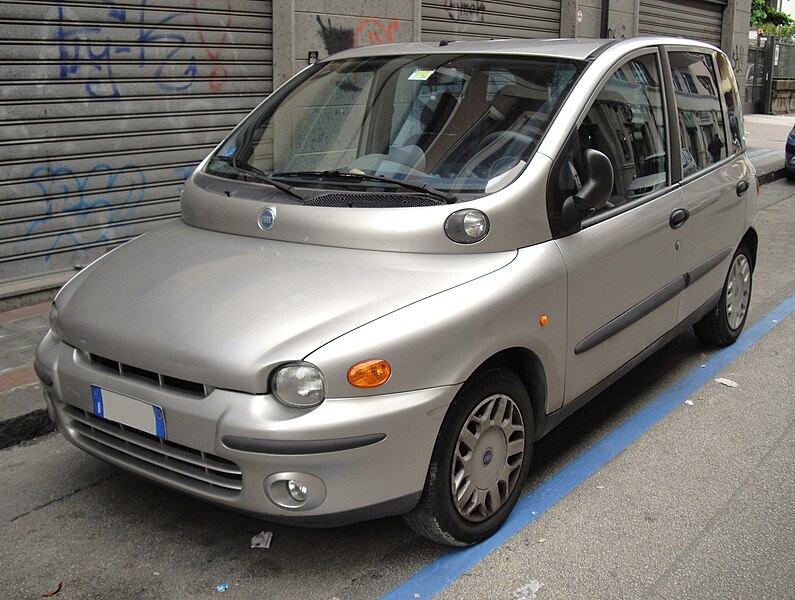
The London 2012 logo deserved to be binned for being as bewilderingly ugly as the pre-facelift Fiat Mutipla without having the excuse of being useful in any way. Unfortunately, it's too late to replace it with something better now and, inexcusably horrible though it looks, I suppose anything that infuriates Ahmadinejad and Iran's Mad Mullahs can't be all bad.


 * London 2012 logo photograph © copyright Nigel Chadwick and licensed for reuse under this Creative Commons Licence.

Thursday, 16 September 2010

The world's greatest headless dad

Today, Radio 4's excellent "A History of the World in 100 Objects" featured a beautiful jade cup made for the Timurid Emperor Ulugh Beg, grandson of Timur (AKA Tamburlaine The Great). Apparently, Ulugh Beg was a cultured fellow, a lover of mathematics and astronomy, whose patronage got the Observatory of Samarkand built.  A crater on the moon is named after this astronomer-king.

Sadly, although he was a notable intellectual and patron, Ulugh Beg didn't really cut it in the world of power politics.* His rule lasted only two years. The BBC web site notes:

This jade cup from Central Asia would have been valued for its beauty and its protective powers. When this cup was made it was believed that jade would crack if it came into contact with poison...

Ulugh Beg would have owned such a cup to protect himself from assassination by his rivals. However, the cup could not save him from his own son who seized power in 1449 and had Ulugh beheaded.
The clouded jade cup is a rather lovely thing, but this is one of those times when I'd gladly not trade places with the rich and powerful. When my son gets old enough to buy presents, I'd be happy to get a cheap and nasty, mass-produced "World's Greatest Dad" mug and a promise not to decapitate daddy. I'm easily pleased.

*A reputation he shared with the Holy Roman Emperor Rudolph II of Bohemia.