Apart from the busyness of the design, that is, and the now dodgy associations of the fasces. To be fair, there are a lot of cluttered flag designs featuring a coat of arms, and Ecuador's isn't the only coat of arms to still feature a fasces - there's one on Watford Borough Council's coat of arms, too.
Watford Borough Coat of arms (image credit Heraldry Wiki contributor Knorrepoes)
Spooky coincidence; the fasces-bearing arms of Watford Borough Council were granted in October 1922, the very same year and month when Mussolini marched on Rome and then took power in Italy.
Anyway, back to Ecuador's flag, and the oddest thing about it (in my opinion). Look at the coat of arms in the middle.
The odd thing isn't the condor on top, the fasces on the bottom or the shield (?) depicting a sun, mountain, river and ship in the middle. It's what flanks the design; halberds from which are draped ... Ecuadorian flags. It's a flag containing little copies of itself. A recursive flag. A bit like the Droste effect, only not quite, with more than one small copy.
I'm now idly wondering whether there are any other flags which contain images of themselves. I think there probably must be some (although not necessarily national flags). My very quick web search hasn't turned any up, although it did come up with some recursive flags identified by Redditor and vexillology enthusiast Cawren. The trouble is, Cawren's definition of recursive wasn't quite what I was looking for; the flags cited are ones where you can zoom in infinitely, keeping the same aspect ratio and the flag will stay the same, i.e. a very boring fractal, as illustrated below.
But it's flags which literally contain pictures of themselves that I'd like to see and some time when I have more time and energy I'll devote more than a couple of minutes to looking for more examples. Or maybe I won't. Who knows?
Watch this space. Or don't.
Anyhow for no other reason than it seems appropriate, here's my favourite remix of that 1997 banger Ecuador, originally a hit for the DJ and record production team Sash!* (it got to number one in Flanders, Romania and Scotland).
Enjoy.
.
*I should point out, for those too young or old to be aware, that the exclamation mark is part of Sash!'s name, like Westward Ho! But the asterisk isn't. Obviously.
In common with most far-right rallies/insurrections, there were flags. Lots of flags. So many flags.
America's Swastika, AKA the Confederate Flag was a popular choice among the flag-shagging Trumpist ultras because of course it was:
Image credit Reuters.
Now the thing about this "Confederate Flag", as quite a few people know, is that it wasn't the national flag of the Confederacy. The reason that this now-established and instantly recognisable symbol of white supremacy differs from the national flag(s) of the Confederacy is an interesting one. It's all to do with identity, and not just in the obvious, ideological sense of political identity, but in the direct, practical sense of distinguishing friend from foe.
When the Confederate States seceded, like every new state, they wanted a flag of their own, and this was what they came up with:
As you can see, it's inspired by the flag of the USA, but with fewer stripes and a Betsy Ross-style circle of seven white stars in the blue canton, representing the original seven breakaway states (more stars were added to the original design as the number of rebel states joining the Confederacy increased).
Can you see what's wrong with this picture? Well, if you were a Confederate soldier, going into battle under this banner, you soon would have. It looked way too much like the opposition's flag, especially in the heat of battle, or when the wind dropped so the design of the flag wasn't clearly discernible.
By the end of 1861, the Army of Northern Virginia had come up with a solution. A flag (based on a previously rejected proposal for a Confederate national flag) which looked nothing like the ones the Yankees were carrying in to battle. It was a square battle flag with a dark blue saltire on a red background, outlined in white, and bearing the Confederate states' stars on the arms of the saltire:
The rectangular variant of this flag, as carried by the Trumpist in the first picture started life as another battle flag inspired by the North Virginian version, namely the Battle Flag of the Army of Tennessee.
As for the original national flag, the unfortunate symbolism of it looking like the other sides' flag, plus all those friendly fire incidents, made it unpopular and the Confederates decided to go for a rebrand.
And, boy, was this one a doozy.
One part of the redesign actually made rational sense. The new flag design took the USA-like stars-on-a-blue background design out of the canton & replaced it with the dissimilar Confederate battle flag.
But the background colour of the flag was pure ideology, with zero concessions to common sense. Out went the red and white stripes of the previous versions, replaced by a pure white background.
"Our idea is simply to combine the present battle-flag with a pure white
standard sheet; our Southern Cross, blue on a red field, to take the
place on the white flag that is occupied by the blue union in the old
United States flag, or the St. George’s cross in the British flag. As a
people, we are fighting to maintain the Heaven-ordained supremacy of the
white man over the inferior or colored race; a white flag would thus be
emblematical of our cause."
So the ideology was there, right in your face. Something you couldn't say about the practicality of the redesign. OK, you couldn't mistake the bearer for a damn Yankee on the battlefield. What you could easily mistake his flag for was a white flag of truce, with hilariously tragic consequences.
White supremacists, folks. Shooting themselves in the balls since 1863.
The mainly-white flag (AKA the "Stainless Banner") was such a tactical self-own that a third major redesign of the Confederate national flag was inevitable from day one. By 1865 the Confederates had got their shit together sufficiently to design a national flag that didn't signal surrender to the enemy, by adding a vertical red identification stripe to the design (this iteration was nicknamed the "Blood-Stained Banner"):
Unfortunately for the Confederates, by this stage time was running out for both the Confederacy and for recognition of the final version of its national flag to become embedded. Which is why the only flags of the insurrectionist South that are widely recognised today are variants of its distinctive battle flag.
So now that we're all up to speed with Confederate vexillology, we're also better equipped to engage in the battle of ideas with those inevitable apologists who claim, falsely that Confederate iconography has nothing to do with white supremacy and racism, and that the Civil War wasn't a war to defend slavery and white supremacy, but "States' rights" or some such nonsense.
So, if you're some alt-right wannabe edgelord hanging around waiting to "destroy" me with BS talking points like this, come at me, bro. I'm so ready for you.
I know the enemy.
Update: Rebecca Watson gave a great summary of the probably apocryphal auto-tasered testicles story:
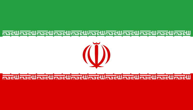
This thing here is the flag of the Islamic Republic of Iran. It's your standard green-white-red horizontal tricolour, with the words 'God is Great' added, in Kufic script, to the edges of the colour bands (just in case the aggressive piety implicit in the words "Islamic Republic" was too subtle for you). But what's going on with that weird symbol in the middle? Glad you asked:
Not only is all that symbolism about blood and self-sacrifice bang on the money, given the brutal human rights abuses for which this crackpot theocracy is famous, but the suggestive design of nested crescents around a vertical central stroke has also prompted some irreverently creative re-imagining. Here's Iranian-born secularist and human rights campaigner Maryam Namazie, explaining how she incorporated the flag of the Islamic Republic into her recent nude protest for International Womens' Day (some images may be considered NSFW, although to my mind a woman's standard reproductive equipment is infinitely less offensive than the banner of an oppressive, fanatical, blood-spattered tyranny):
Congratulations, Hamid Nadimi. You are personally responsible for the most gynaecologically memorable piece of design
since the front end of the Ford Edsel. Everyone can now remember the flag of the Islamic Republic of Iran as 'that one with the lady bits on it.' You must be so proud.
Hegel remarks somewhere that all great world-historic facts and personages appear, so to speak, twice. He forgot to add: the first time as tragedy, the second time as farce.
So, famously, wrote Karl Marx. I'm sceptical - it's one of those sweeping generalisations that sounds as if it pithily captures the essence of things, but falls apart on closer scrutiny - what about all those times when history doesn't repeat itself at all? With the benefit of hindsight, historians routinely criticise unsuccessful generals for fighting the last war and being foolishly unprepared for the changed reality of the contemporary battlefield.
Sometimes events do follow a similar pattern, but don't follow the path from tragedy to levity. For example Napoleon's doomed Russian campaign was a tragic waste of life and a military failure. Hitler followed in his footsteps 130 years later. Was the later invasion, with its grim privation, five million dead, countless war crimes and merciless brutality somehow more ligthweight and just a bit of a laugh? I don't think so.
I think, however, there's a modern variation of Marx's formulation that does more or less hold true, at least in the developed and developing world:
History repeats itself occurring first as epic, the second time as a heritage-themed marketing opportunity
This less pity phrase occurred to me on hearing that the Indian entrepreneur Sanjiv Mehta is resurrecting the East India Company as "a consumer brand focused on luxury foodstuffs". There's a faint echo of the old East India Company here - it did, after all, start out trading in luxury goods like silk and tea. But the scale, ruthlessness and ambition of the old monopoly enterprise contrasts starkly with the company's new incarnation as an up-market deli, selling expensive tea and posh chocolates to the more prosperous shoppers in the West End.
The old East India Company in its heyday was an economic and military juggernaut, leading the way to British Imperial domination of India. When Clive defeated the Nawab of Bengal and his French allies at the Battle of Plessey, he wasn't commanding regiments of the British Army, but an army belonging to the British East India Company.
In the recent past there's has been justified concern about the activities of "private armies" like Blackwater USA in Iraq. These activities, though, were miniscule in comparison with the British East India Company's role as the military spearhead of regime change in India. Subsequently, the East India Company involved itself in the highly profitable business of growing Opium in British India and trafficking it to China. The "war on drugs" is another historical conflict that keeps on coming back. The wisdom of fighting a war against illegal drugs may be questionable, but at least it's an improvement on fighting a war to keep the drug barons of the East India Company in healthy profits.
The old East India Company was like a Norman Castle - a powerful fact and symbol of economic, political and economic power and dominance, real, huge and inescapable. The new one is more like the National Trust gift shop in a Norman castle - a retail outlet for discretionary spending and the consumption of sanitised heritage. Marx would probably have been amused, although, IMHO, not vindicated.
"There is hopeful symbolism in the fact that flags do not wave in a vacuum"
Arthur C. Clarke
Greetings, fellow earthlings! The image above is a design for the Flag of the Earth, created by James W. Cadle in 1970, in the wake of the first Apollo moon landing. It features a stylised section of the sun's disc, a blue circle representing the earth and a smaller white circle for the moon. It's an interesting alternative to the other coloured scraps of cloth that humans are always squabbling over and deserves another showing, with the 40th anniversary of Apollo 11 coming up.
I started looking at flag-related trivia after reading Flags of Forgotten Countries at Dark Roasted Blend (an article from which I pinched the Arthur C Clarke quote above). Among many other factoids, I discovered the origin of the two-headed eagle that became a symbol of Russia under the Tsars (and has been rehabilitated by the nationalists in the present Russian Federation). I'd always thought that this mutant bird looked a bit odd, but didn't know why it had two heads. The reason, apparently, is that the bird was first used on a Byzantine standard. It was a version of the Roman Eagle, the two heads, symbolising the fact that the Byzantine Empire looked both west to Europe and east to Asia. Here's a version of one of the the original Byzantine double-headed eagles, the emblem of the Palaiologos dynasty:
After the fall of Constantinople, Byzantine refugees ended up in Moscow, where their Imperial symbol was adopted by their Russian Orthodox coreligionists. At various times, this funny-looking bird has also been adopted as a national symbol by Albania, the Austro-Hungarian Empire, the Holy Roman Empire, Montenegro, Serbia and the Kingdom of Yugoslavia, among others.
No yearly round robin letter from me - just a blog about anything odd, entertaining, surprising or interesting enough to share with friends, family and other sentient lifeforms.
Also contains witterings about politics, society and the economy (mainly from the socially liberal/left quadrant of the political compass), along with a bit of marvelling in stunned disbelief at religion, Brexit and other odd belief systems.
I am not really called Robin, nor have I ever been.
Occasional tweets at twitter.com/2primates